- Joined
- Nov 26, 2020
- Messages
- 35
When designing a map you should first consider the way you want the viewer to read the information that you want to present. Do you want them to see how a measurement varies across a geographic area? Do you want to show the level of variability within a specific region? Or do you want to indicate busy pockets of activity or the relative volume/density within an area?
There are a variety of ways you can approach visualizing data. For maps there are 3 major considerations when creating your visualization:
Dot Density: A map style that uses a dot or other point symbol to show the collective presence (density) of a feature or phenomenon. For example, showing busy intersections or high/low volumes of activity within areas.

Absolute Proportional Method: This style uses geometrically shaped symbols, like circles and squares, to proportionally represent the (absolute) value of the phenomenon within an area. This style is often used to represent absolute area data.

Choropleth: This is a thematic map style that applies shaded color or pattern textures in proportion to the intensity of the data being displayed on the map. For example, showing population density or average house prices.

Hexagonal binning: This map style is good for showing general themes over a geography. It is less granular than dot density and not constrained by boundaries as is the case with choropleth maps.

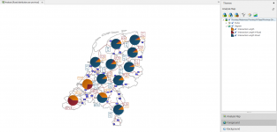
Diagram maps: Diagram Maps area simply maps that contains diagrams. An advantage of adding diagrams to maps would be to put the diagrams in their geographical context. It is very important to keep the background map of the diagrams simple and readable. Avoid complex topographic map as the base for diagram maps. It can be useful to have an choropleth as a background for your diagram map.

Qualitative Classification: This style makes the color or size of the geometrical object dependent on a characteristic of the object.

Heatmaps: This map style enables the map viewer to perceive density of points independently of the zoom factor. It is the least constrained of them all because it does not correspond to geographic bounds.
There are a variety of ways you can approach visualizing data. For maps there are 3 major considerations when creating your visualization:
- Map Type
- Color Palette
- Text Font
Dot Density: A map style that uses a dot or other point symbol to show the collective presence (density) of a feature or phenomenon. For example, showing busy intersections or high/low volumes of activity within areas.
Absolute Proportional Method: This style uses geometrically shaped symbols, like circles and squares, to proportionally represent the (absolute) value of the phenomenon within an area. This style is often used to represent absolute area data.
Choropleth: This is a thematic map style that applies shaded color or pattern textures in proportion to the intensity of the data being displayed on the map. For example, showing population density or average house prices.
Hexagonal binning: This map style is good for showing general themes over a geography. It is less granular than dot density and not constrained by boundaries as is the case with choropleth maps.
Diagram maps: Diagram Maps area simply maps that contains diagrams. An advantage of adding diagrams to maps would be to put the diagrams in their geographical context. It is very important to keep the background map of the diagrams simple and readable. Avoid complex topographic map as the base for diagram maps. It can be useful to have an choropleth as a background for your diagram map.
Qualitative Classification: This style makes the color or size of the geometrical object dependent on a characteristic of the object.
Heatmaps: This map style enables the map viewer to perceive density of points independently of the zoom factor. It is the least constrained of them all because it does not correspond to geographic bounds.
Attachments
Last edited: